Enrico Galati
UX/UI Designer
Technology becomes simple when you start from people.
How I workI do the research and the design myself: what I learn from interviews and tests becomes the interface, and only what the data confirms stays.
- ECHA, Helsinki — Product Management2026
- POLI.design — UX and UI Design2025
- Suor Orsola — Psychology, cognitive ergonomics, 110/110 cum laude2024
- Re:Lab — Interaction Engineering, automotive HMI2023
Work
IUCLID
Open the projectVersion 6 brought IUCLID far enough to carry real improvements. To find out which ones, ECHA chose to start from the people who use it. I planned and ran the consultation: 154 responses on EU Survey and 29 interviews across national authorities, industry, technical experts, EU and OECD partners and ECHA’s own staff, anonymised by hand for GDPR. In Power BI I cross-referenced the survey figures with the ones drawn from the interviews.
TripLoop
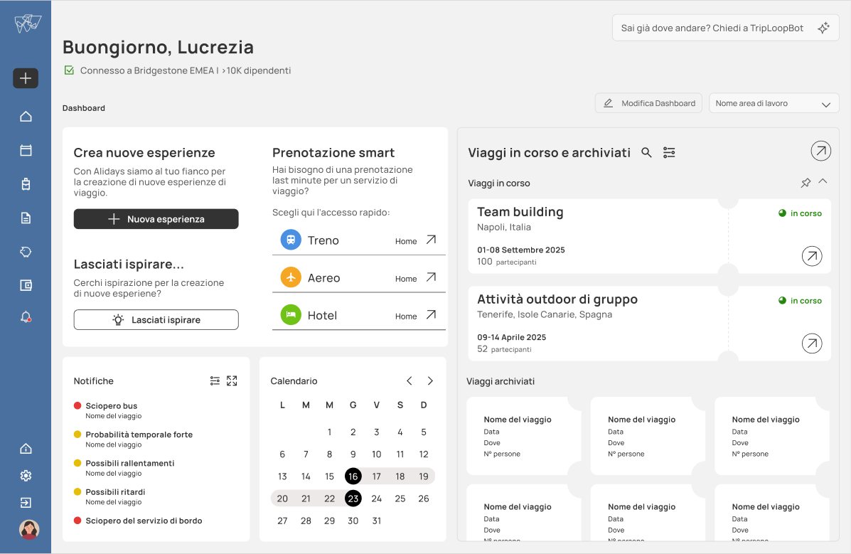
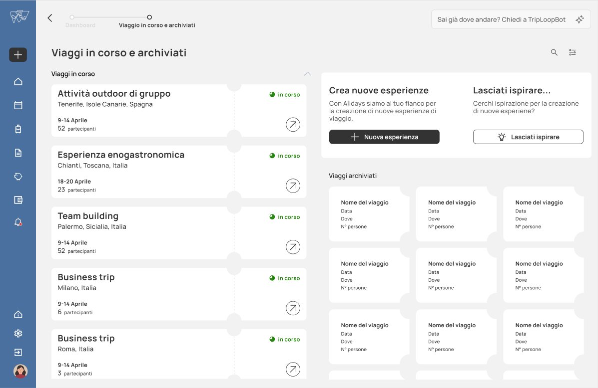
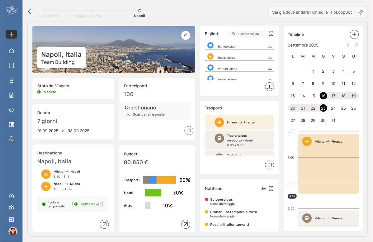
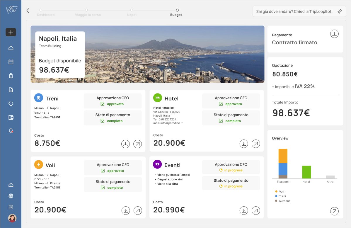
Open the projectTripLoop brings bookings, budget, transport and disruptions for business travel into one place. Another group on the master’s course had designed the UX; the three of us designed the interface like a station, in the colours of the Swiss metro. I looked after the colour, the micro-animations and the ticket card: whole for upcoming trips, torn for archived ones. In the eye-tracking test the gaze followed the order we had planned.
Alidays
for Creators
Open the project
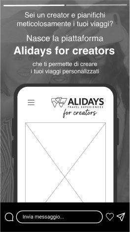
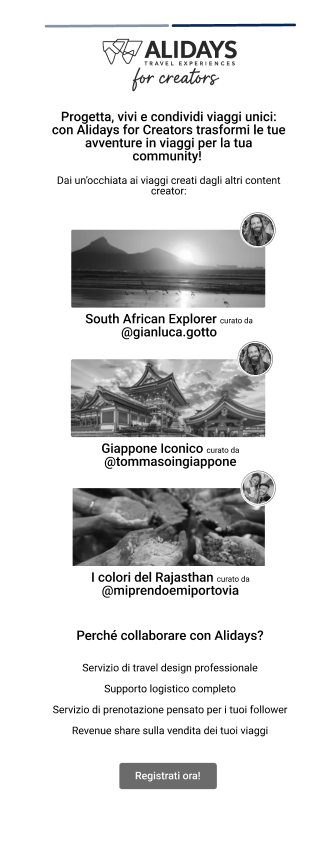
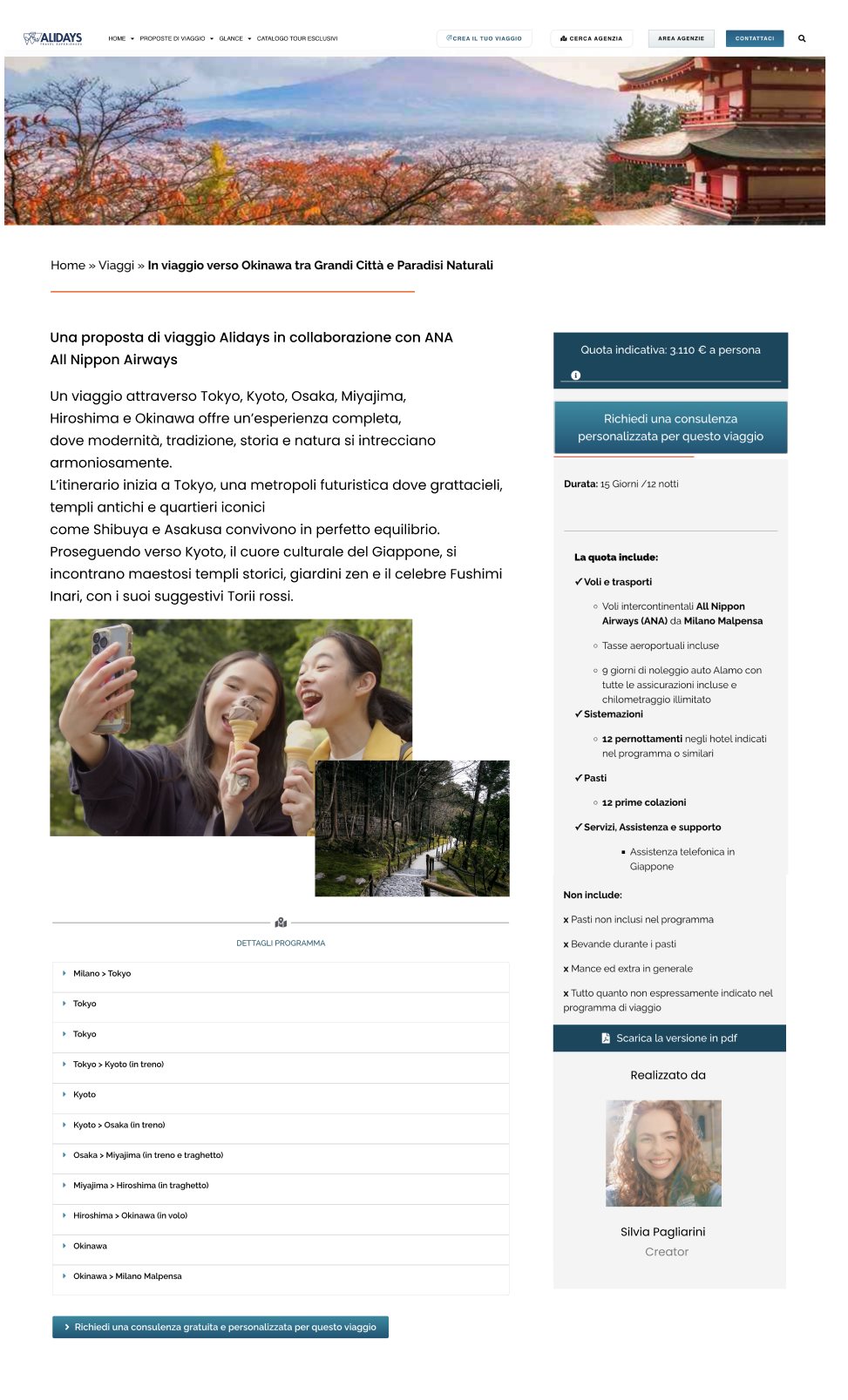
I thought a tour operator and a travel creator had nothing in common. I led the research, from netnography to interviews, and it proved me wrong: both sell the credibility of someone who promises a trip will be memorable. The platform comes from there. The creator proposes a trip, builds it with Alidays asynchronously and tries it in person; then the package goes online and their followers book it.
IUCLID
I planned and ran the consultation with the people who use IUCLID: six months, from the questions to the findings.
IUCLID is the database the European Chemicals Agency uses for regulatory dossiers. Version 6 brought it to a maturity where real improvements can be built on top, and that is where the consultation comes from: finding where it can grow, starting from the work people actually do. On the other side of the table were national authorities, industry, technical experts, EU and OECD partners and ECHA’s own staff. Remote interviews, in English, from twenty minutes to an hour.
The survey and the interviews were both needed.
People answer a questionnaire one way and describe their own work another way. The questionnaire measures where IUCLID stands today, the interviews bring out what is missing for the people who open it every morning. The survey ran on EU Survey. I wrote the interview guide, the questionnaire and the supporting material.
I anonymised every interview by hand, one at a time.
Transcripts from Teams, manual anonymisation for GDPR, then content analysis and thematic analysis. AI proposed the patterns, I checked them against the transcripts: on anonymised data only, and never through a platform without consent. In Power BI I built a star schema that cross-references the survey figures with the ones drawn from the interviews. Before ECHA I had never opened Power BI.
A job planned until the end of October, finished by the end of August.
This was not part of my research. 24 languages, over 500 phrases each to reformat by hand into a template. I proposed handing them to AI: one day tuning the prompt, 83% accuracy, three days of human correction. The AI could not write a slash, so I used XQX as a placeholder, a sequence that does not exist in any of the 24 languages.
The findings come out in the official report and will guide IUCLID’s development.
I presented the work to the team and it landed well. On the content of the research, until publication, I cannot say more.
“He successfully planned and managed this complex project, engaging with a wide range of stakeholders.”
Mark Roberts, Regulatory Officer, ECHA · my team leaderTripLoop
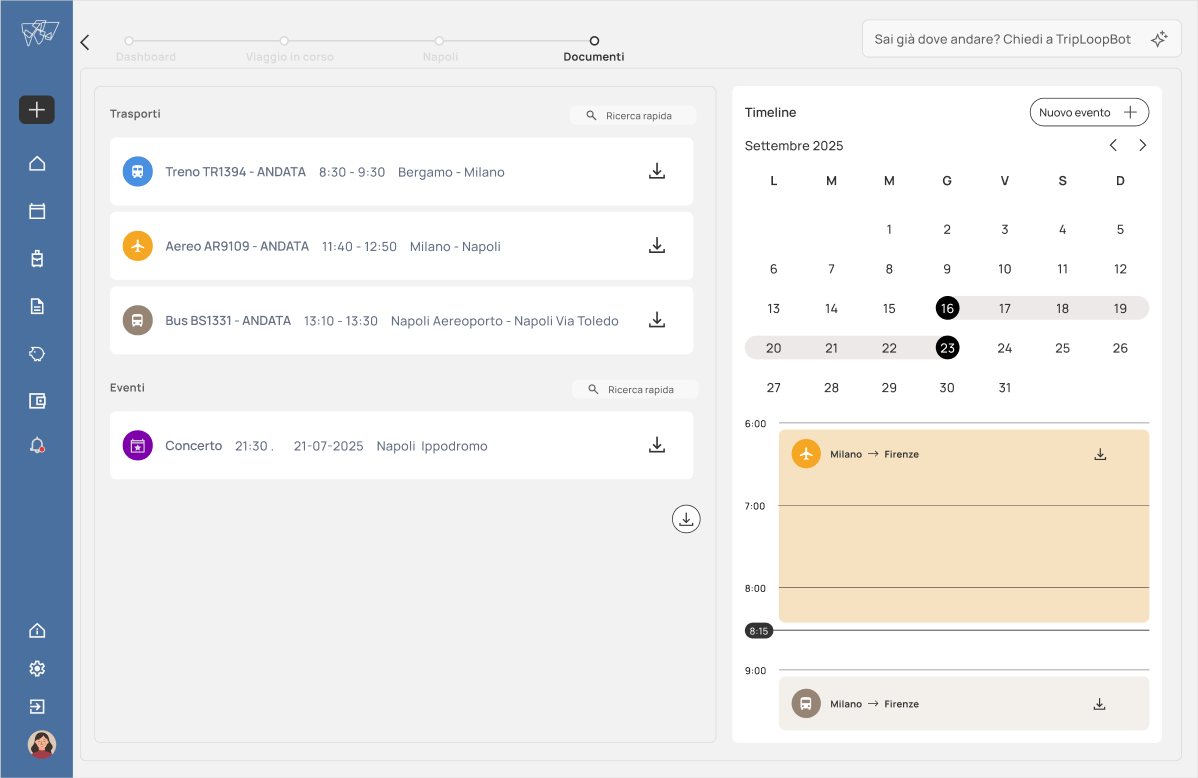
UI for a business-travel platform: bookings, budget, transport and disruptions in one place. We designed it like a station.
Another group on the master’s course had designed the UX, again on an Alidays brief, so the research was not ours. The three of us designed the interface. Alidays and the tutors rated the work well.
Four services, four colours.
The four colours come from the Swiss metro. Swiss Style uses bright tones you can read from a distance, which is what a station needs: knowing where to go without stopping to read. They do the same job here, the colour arrives before the label. Manrope across the whole interface.
The only card drawn from scratch is a ticket. Whole for the trips ahead, torn for the archived ones.
The trip’s status sits in the shape of the object, so you neither remember it nor read it. Tearing is a gesture the user knows from the physical world. And a work trip is often team bonding too: the stub left in a pocket says that trip happened. Building it taught me Figma features I had not used.
Hover a service and it fills with its colour.
I handled the prototype’s micro-animations. Short, tied to the transport colour code, and built to recall a metro line: the button opens the way a route extends.
One user, no changes.
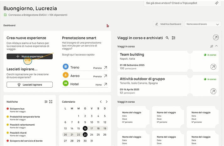
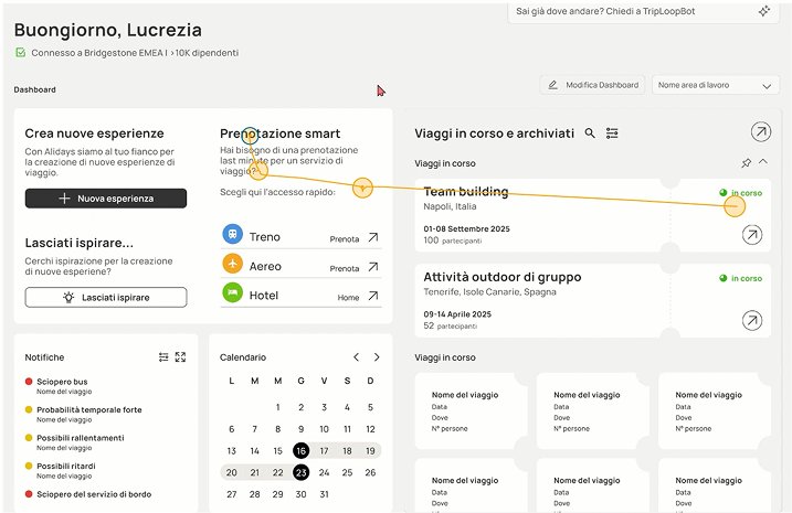
Eye-tracking test with one person. The equipment belonged to the course; I gave the tasks and asked the questions. We had predicted a precise order: the black new-experience button first, then quick booking by service, then the trips in progress and the past ones. The gaze followed that order, so we changed nothing. In my thesis I had designed a protocol around that same instrument, so I knew what to measure.
Alidays
for Creators
A platform where travel creators pitch trips to Alidays and their followers book them.
A real brief from the tour operator partnered with the course. Collaborative work, everyone on everything; I led the research: netnography, participant sourcing, interviews.
“We are at the mercy of the algorithm.”
The creator loses reach without posting constantly, and does not know the rules the algorithm rewards them by. Brands often pay in products, sometimes at ninety days. Travelling alone, they organise everything themselves. The platform gives them a scheduled collaboration, with dates and fees agreed before departure.
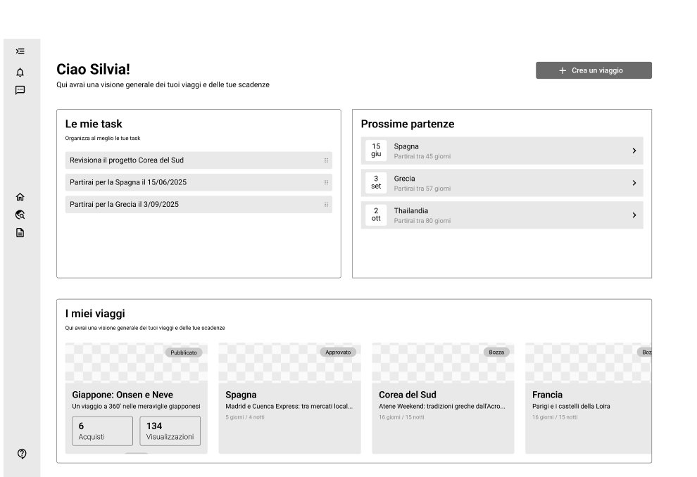
Silvia
30–35. She has a main job, travel blogging is the second one. Built as a course exercise, she stayed at the centre of the project.
“I’d like to focus on the quality of the content, but without consistency the algorithm cuts me out.”
Wants
- Authentic, local destinations
- Growing the community with real advice
- Getting better at photo and video
Held back by
- The algorithm, unless she posts constantly
- Collaborations paid in products
- The logistics of travelling alone
The creator proposes, then builds.
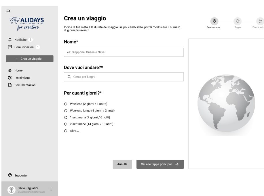
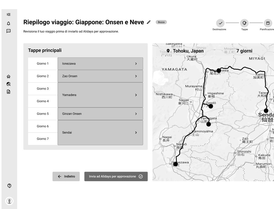
Two routes were open: a running conversation with an Alidays contact, or a proposal that travels on its own. We chose the second. The creator uploads the trip, an Alidays employee reviews it asynchronously, and the document changes many times before approval. Then the creator leaves on a trial trip, checks that it holds up, and only then does the package go on sale.
Why it pays for both.
Alidays gets packages it would not have built alone, and the creator’s followers booking them. The creator gets a pilot trip, covered in full or in part depending on the contract, and the content to publish on the way back.
We took the patterns from Notion, Airbnb and WeRoad.
Silvia comes to the product with deadlines and content to produce. Every new pattern she has to learn is time taken from her work, so we used patterns she already knows. WeRoad for the group trip, Airbnb for the stay, Notion for a document that keeps changing.
Five years between psychology and design.
Cognitive ergonomics studies how people use objects. Interfaces are objects. The visual side I learned afterwards, on an executive course and on the job.
- Traineeship in Product Management, Requirements EngineeringECHA, Helsinki03-08/2026
- Mapping for the “Bosco di Oz” project, freelanceAPS Lapsus04-05/2026
- UX/UI Designer, including pro-bonoIndependent projectssince 04/2025
- Teaching assistant, cognitive artifact designSuor Orsola Benincasa10/2024-02/2026
- Traineeship in Interaction Engineering, automotive HMIRe:Lab10/2022-03/2023
- Executive course in UX and UI DesignPOLI.design03-06/2025
- Apple Developer Academy2023-2024Federico II University
- M.Sc. in Psychology: cognitive ergonomics. 110/110 cum laude. Thesis in Interaction Design on the driver’s cognitive loadSuor Orsola Benincasa2021-2024
- B.Sc. in Psychological Sciences and TechniquesFederico II2016-2020